Choosing the colour of your logo
14/05/2011
How do you choose the colour of your website or logo and does it matter?
Yes it does!
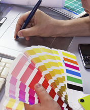
A well designed website will need to take the colour palette from the logo or branding. This may allow some flexibility but the main tone of the colours will be defined.
Different colours convey different meanings. At the simplistic level you might have:
- Blue as the intellectual colour
- Yellow as the emotional colour
- Red as a powerful colour
- Green as a natural colour
- Orange as a fun colour
- Purple as a luxury colour
- Black as a sophisticated colour
- White as simple, uncluttered colour
- Brown as a trustworthy non sales colour
But of course within any main colour there are different shades. So, for example although most shades of blue suit a corporate, professional, intellectual or business images, there are bright blues suitable for fun type websites, or pale cool blues suitable for websites wanting to give a an uncluttered image, or pale warmer blue colours which work well with images of luxury or health-care.
Very important are the secondary and tertiary colours, as these influence how we see the main colour. And the choice of highlight colour is important. The best highlight colours are red or orange, or yellow on non white background. There is a real physical reason for this relating to the wavelength of light. Our eyes see objects in these colour a little further forwards, standing out. By contrast the blue and greens are seen to recede a little. Shop keepers have know this instinctively for years, which is why 'for sale' signs are in red and not blue.
A close matching palette from the same main colour will usually create a more sophisticated and luxurious feeling, whereas a palette of very different colours willl produce a more dynamic and attention grabbing image.
With websites there has historically been a lot of blue websites and this is for the technical reason that when designers were restricted to web safe colours there was a good range of available colours within the blue range. By contrast the colour green was difficult to work with if restricted to web safe colours. Now that this is no longer a restiction designers have much mroe freedom to generate good designs in any colour palette.