Colours and their meaning
The colour of a website has a huge impact on the image it conveys. This in turn affects the image and the effectiveness of the website for the required task.
Blue websites
Blue is the intellectual colour, conveying trust and professionalism.
The blue colour is a relaxing colour, and a colour for good clear communication. Soft blues are calming, stronger blues stimulate thought. A very good choice for business websites, although can be perceived as less friendly. There is a good selection of web-safe blue colours that also make blue an easier colour to design with for online media.
Yellow websites
Yellow is an emotional colour, often associated with happiness, optimism and creativity.
Given the above it is surprising there are not more yellow websites, but perhaps this is due to the difficulties of poor contrast for a yellow logo in print (on a white background). Some authors think too much yellow in a website can make people anxious.
Red websites
Red is a powerful colour, often referred to as the 'physical' colour.
The red colour has the longest wavelength and this helps it appear 'nearer' than it is, so it stands out from the background in an attention grabbing way. A good choice for headlines, 'buy now' or 'sale offer' type slogans. When used throughout a website as the basic colour it can give the image of masculinity or aggressiveness, but also of friendship and love.
Green websites
Green is a natural colour, associated with the environment, harmony and rest.
Green is supposed to be one of the most restful colours, but is not used as frequently as blue. This may be because it is harder to create a good spectrum of different greens that match well together. This is certainly true if restricted to web safe colours.
Orange websites
Orange is a fun colour, and stands out well.
Not a very common colour within website design.
Purple / violet websites
Violet is a colour of luxury or spiritual values
Violet has the shortest wavelength, and is opposite to red in that it appears to be further away. The darker colours are associated with royalty, quality and luxury as well as space and spiritual thought.
Grey websites
Grey is a neutral colour, but can give a boring impression. Not a good colour for websites that want to encourage the visitor to do something. However grey can be a very good colour used in combination with other colours.
Black websites
Black is a sophisticated colour. But also a menacing colour.
For websites, black is used both for luxury products and for gothic type websites. One factor with black websites is how they print out; most will print in reverse with a white background and this can lose the intended affect.
White websites
White is a clean and spacious colour.
White can be used to good effect within design websites requiring plenty of space. It gives an uncluttered feel and works well for some types of shopping cart.
Brown websites
Brown conveys honesty and reliability, with associations to the natural world.
A good choice of colour for a website wanting to give the impression of a reliable and supportive organisation.
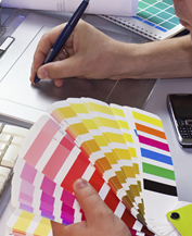
Colour Combinations
The above is a simplistic look at how single colours affect the feel and image of a website. The image can be dramatically changed by altering the secondary and other colours used in the website - or the colour palette. This is why many brand consultants take the time to specify all the entire colour palette that may be used.